Icon sets that are legible at 16px
✓ Micro, Core, Material, and Block render clearly at 16px.
✓ Free tier on every family, no card required
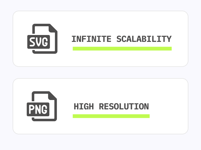
✓ Download as SVG or JSX at 16px. For PNG, export at 400px and scale down to avoid blurry results

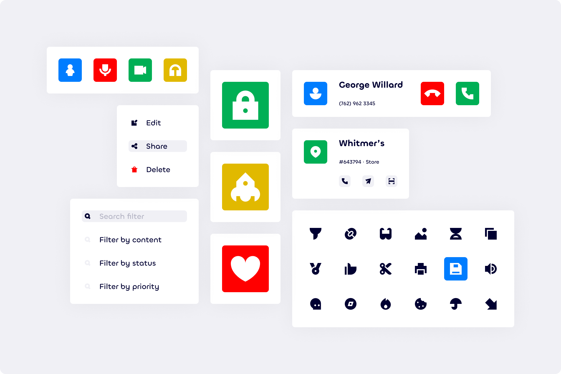
Perfect for interface buttons
Used by the best teams since 12 years


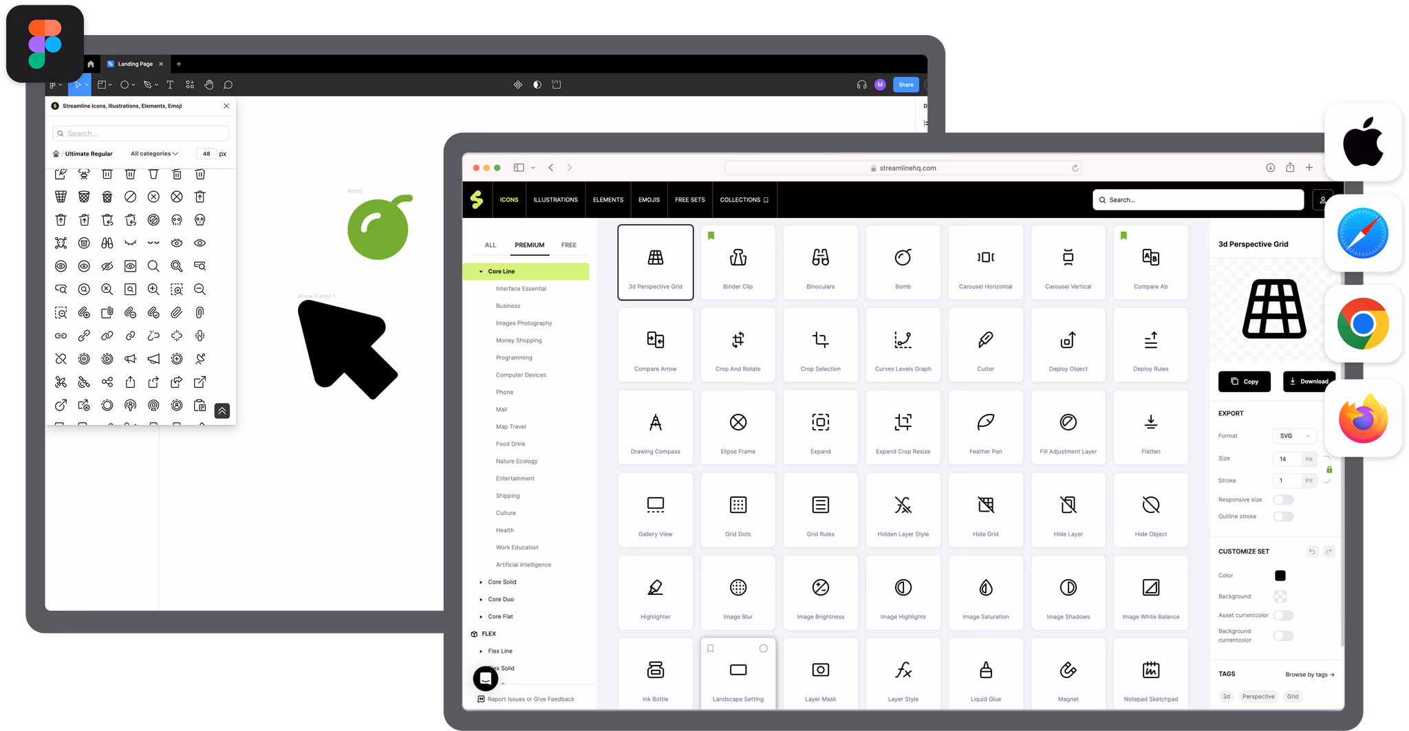
Use 16x16 icons in three steps

Find your 16px icon
Search across Micro, Core, Streamline Material, and Block. All families share categories.
Download as SVG, JSX, or PNG
Export a scalable SVG or a ready-to-use JSX component. For PNG, export at a high resolution like 400px and resize down in your design tool. Exporting at 16px directly produces blurry results.
Drop into your interface
Works in Figma, VS Code, React, or any tool that accepts SVG. Stroke thickness is adjustable on all Line icons.
Micro icon sets
Line and Solid. Two styles, one tiny 10px grid.
Micro
Built on a tiny 10px grid. Minimum detail for maximum legibility at the smallest possible sizes.
Where Micro icons get used
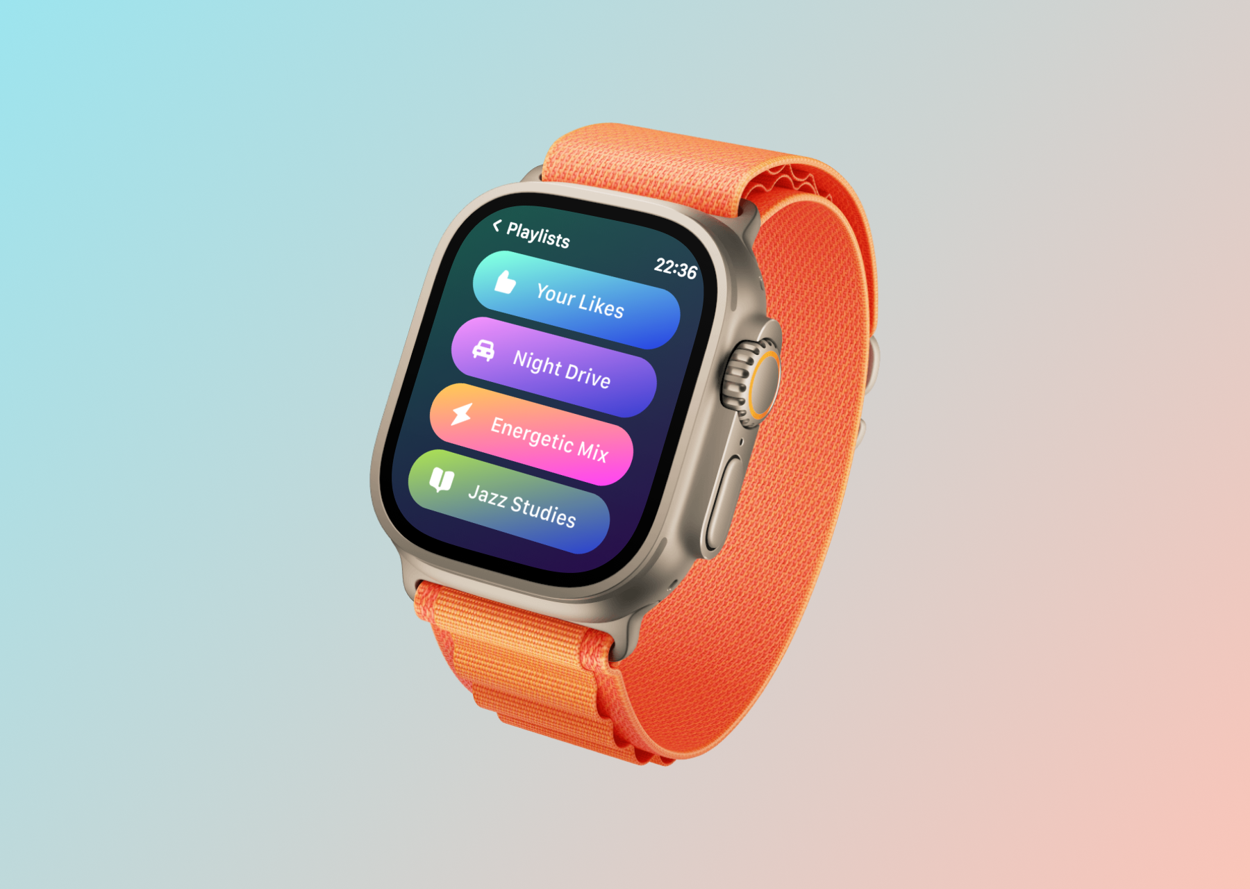
Apple Watch and wearables
Micro is a collection of icons specifically designed to excel on a very tiny scale, designed using simplified shapes to ensure legibility at the smallest possible sizes. That makes them ideal for wearables and any context where size is a hard constraint.
visionOS and spatial computing
Micro icons are perfect for spatial computing interfaces where screen real estate is scarce and clarity at distance is critical. Minimum detail for maximum legibility, even when icons are tiny on an infinite canvas.
Workflow diagrams and pitch decks
Micro icons are perfect for inline text, small navigation buttons, and projects where you need icons to simply help communicate efficiently without drawing too much attention. In workflow diagrams, dense tables, and presentation slides, that restraint is the point. Icons that annotate rather than decorate.
Core icon sets
8 styles, one 14px grid. The Helvetica of icons.
Core
The Helvetica of icons. Built on a 14px grid across 8 styles. Neutral, timeless, and perfectly legible at small sizes.
Where Core icons get used
Built for small sizes from day one
Most icon sets are drawn on a 24px grid. When you use them as 16px icons, thin strokes collapse and details blur. Core and Micro were designed as simplified as possible in order to avoid using irrelevant information. Every shape was built to remain perfectly legible at small sizes.
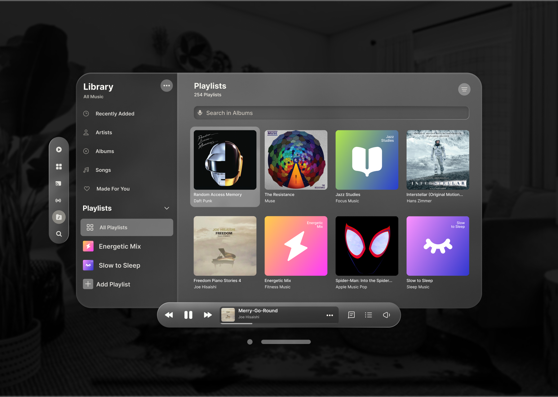
Sidebar navigation and interface buttons
The Core icons are built on a small 14px grid, so they can be used at small size inside a text, as inline icons. Neutral and discrete, its simple construction and legible shapes make it the perfect choice for a neutral and functional design, built to disappear into the interface and let the content lead.
Mail toolbars, dashboards, and dense UIs
Core icons work equally well in a sidebar, a dashboard, a mail toolbar, or inline in body text, on light and dark backgrounds alike. With 8 style variants built from the same grid, switching styles never means rebuilding your icon system.
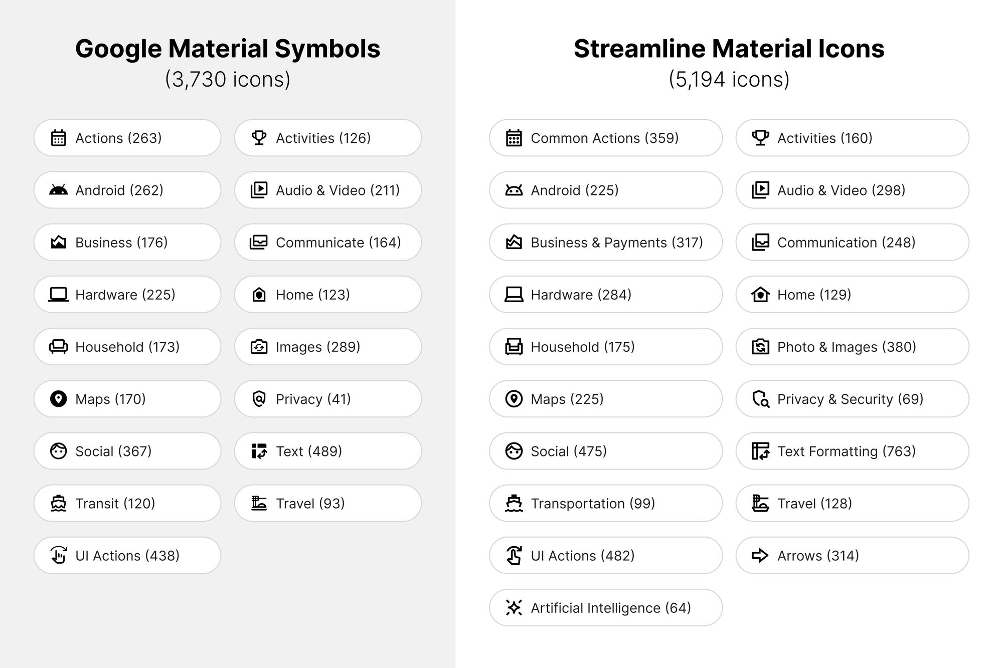
Streamline Material icon sets
Outlined, Rounded, Sharp. Line and Fill. Google Material, done right.
Streamline Material
A complete redesign of Material icons following Google's own geometry rules, redrawn for consistency with improved coverage. Best range is 16-32px with a clean line-to-fill hierarchy across three corner styles.
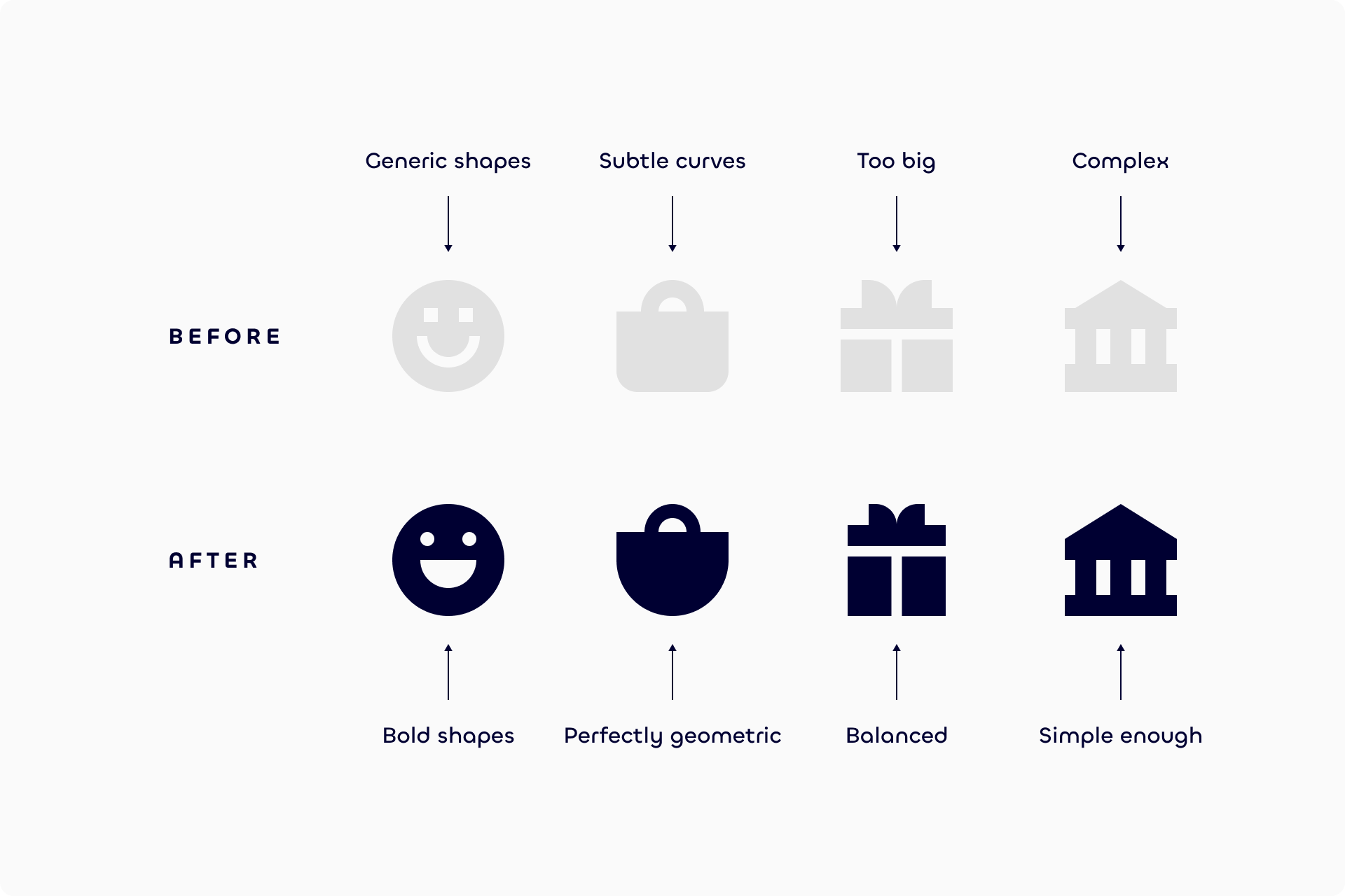
Why Streamline Material beats Google's original
Google Material, rebuilt for legibility
Google Material icons don't even follow their own geometry rules: off-balance strokes, vague shapes. Streamline Material redraws every icon from scratch with better balance between style and legibility, refined shapes that include just enough detail to stay instantly recognizable. The difference is subtle, until you notice it. Then it is impossible to ignore.
1,200 icons Google never made
We've expanded Material Icons far beyond Google's limited set, adding essential icons in AI, business, security, multimedia, and more. Switch between Line and Fill across Outlined, Rounded, and Sharp. A clean line-to-fill hierarchy that works at 16px without changing icon concepts.
Block icon set
300 free icons. Strict 16px Bauhaus geometry. One style.
Block
Bauhaus-inspired icons built on a strict 16px grid. Bold, constructed shapes for wayfinding, geometric minimalism, and UIs that need a distinct visual register.
Where Block icons work
Purity of forms at 16px
Block icons are built on a 16x16px grid with restrictive construction guidelines. Each icon is designed like a logo: a logical but unique grid built from simple geometric shapes. The result is a cohesive and minimalist aesthetic that reflects the timeless Bauhaus spirit of combining art and craft into harmonious and practical designs.
UI, packaging, editorial, signage
Although Block is intended more specifically for UI, it is versatile enough to work in fields ranging from packaging to editorial design, including data visualization and signage. Neutral and timeless sans-serifs like Helvetica, Neue Haas Grotesk, or Geist pair naturally with the set's geometric precision.
Need icons at any size?
Streamline has 180,000+ icons across 40+ families, from the smallest 10px grid icons to large illustrative sets. One subscription covers everything.
Since 2012, the secret tools of the world's best designers.

“I use these icons for virtually every project. It's been a lifesaver. Never search for an icon again. You're welcome.”
BRETT @ DESIGNJOY
DESIGNER AND FOUNDER

“The streamline icon set saves me time and makes my designs more polished and more user friendly. It is worth every penny.”
LUCINDA BROWN
DIGITAL PRODUCT DESIGNER

“Streamline's icons are unique, versatile, and easy to work with. I've found them to be super useful across a range of projects.”
DANIEL BURKA
PRODUCT MANAGER AND DESIGNER
Why grid size matters for 16x16 icons
When an icon is drawn on a 24px grid but rendered as a 16px icon, the shapes scale down by 33%. Thin strokes collapse, rounded corners merge into blobs, and fine details disappear into anti-aliasing. The icon still shows up. It just does not read. This is the core problem with using a standard 24px icon set at 16px.
Core and Micro solve this at the source. Every Core icon was built on a 14x14px grid, which allowed the team to keep shapes simple and focus on legibility. Micro uses a 10x10px grid, the smallest grid ever seen in a commercial icon set, to avoid using unnecessary details. The result is 16px icons that stay clear and readable with no tweaking required.
Free 16x16 icons and how to download them
Every family on this page has a free 16px icon tier. Core includes 998 free icons per style. Micro has 200 free icons. Streamline Material has 999 free icons per style. Block is entirely free at 300 icons. No card required to browse or download the free tier.
To download a 16x16 icon, open any icon in the Streamline app and pick your format. SVG scales to any size and stays sharp at 16px. For a 16x16 PNG, export at 400px and resize down to avoid blurry results. JSX exports are available for React and component-based workflows. All formats are included in every free and pro plan.